







When Drax first released its Biomass Tracker earlier this year, we committed to improving the tool over time. Today, we’re excited to introduce a new interactive map feature that visualises the journey our sustainably sourced woody biomass takes through our global supply chain.
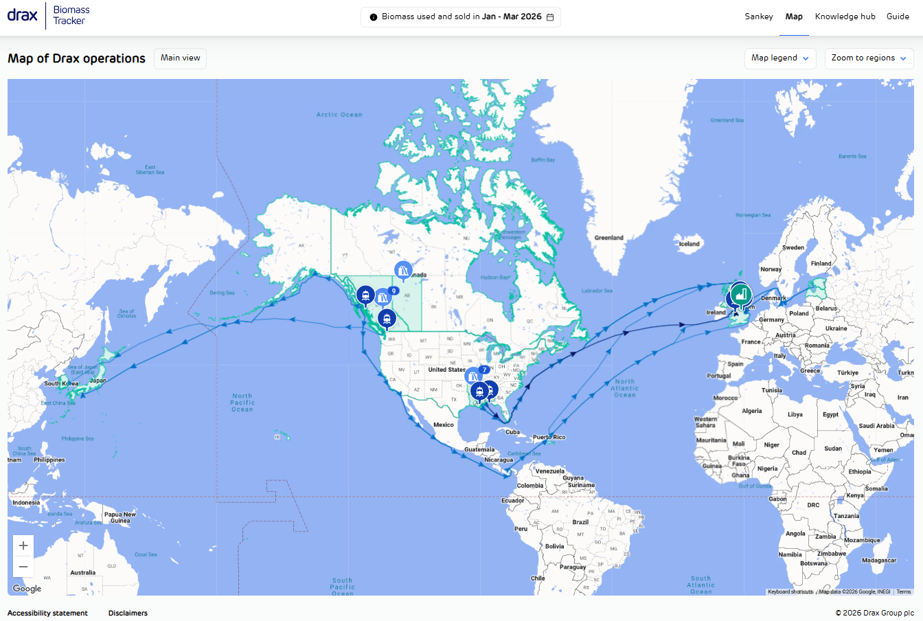
The Biomass Tracker’s new interactive map view provides a clearer picture of Drax’s:
- Supply chain geography: By combining detailed supply chain data with intuitive digital visualisation, we’re making our supply chain data simpler to navigate while painting a clearer picture of how we operate. Because the new map view presents our operations and logistics network geographically, it’s now easier for users to understand how different parts of our supply chain connect.
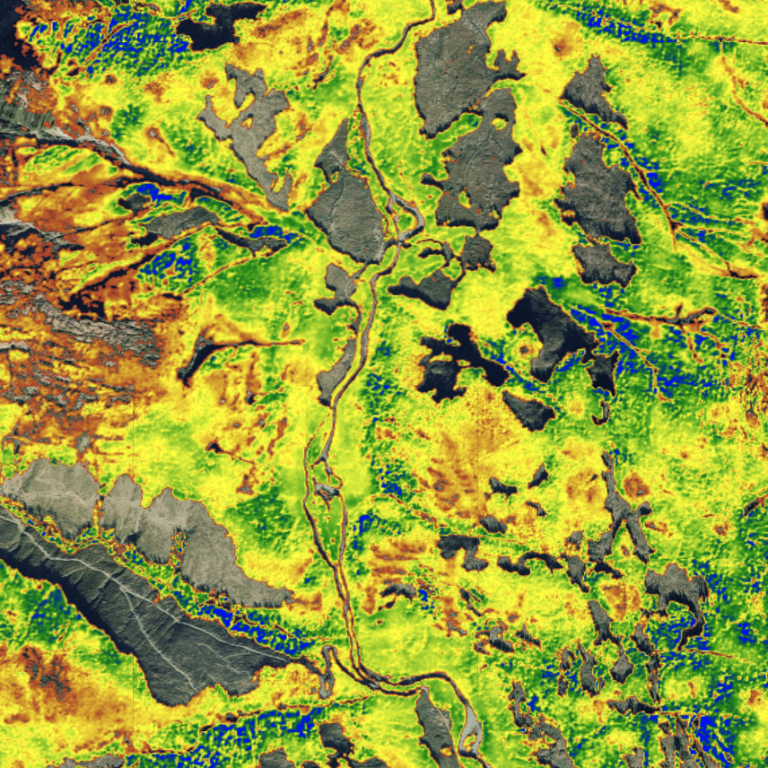
- Pellet feedstocks and forestry: We have expanded the information available on fibre sourcing, with more accessible data on the where biomass used at Drax Power Station comes from. Users can also find more information on the North American forests that we source from, as well as clearer signposting to our biomass sourcing policy and supporting sustainability information.
- Transportation logistics and emissions: The map view includes additional visibility into transportation across our supply chain, including the number of journeys made by road, rail and sea and the associated carbon emissions.
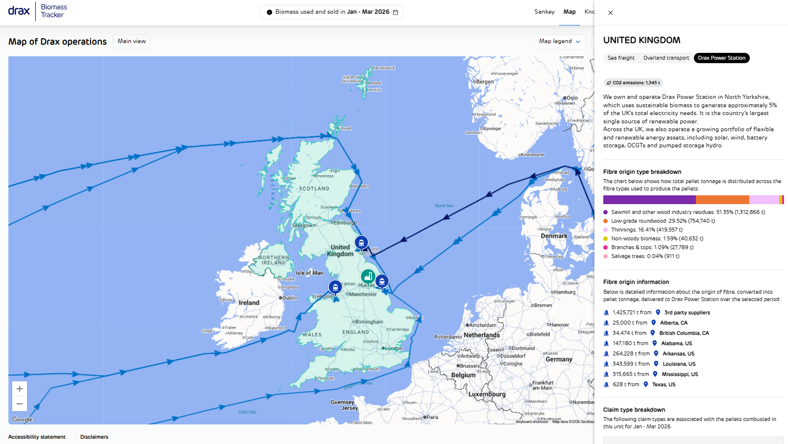
In addition to the interactive map view, the tracker dataset has also been updated to include Q1 2026 data following completion of our internal reporting and assurance processes, with Q2 data to follow after the next reporting cycle.
To view the full tracker, we recommend viewing it on a desktop or laptop device.